Share Like A Boss
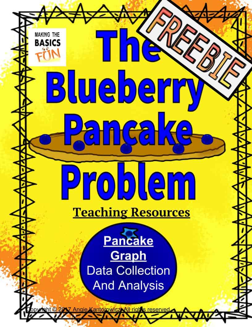
The Blueberry Pancake Problem And Graphing Freebie
Does your class love to collect data and then graph their results? Does this sound a bit daunting? No worries use “The Blueberry Pancake Problem” and Graphing Freebie to help you make this a great activity. I’ve got the entire process down below with a bunch of pro tips built in. You and your students are going to love this activity.
This one requires a bit of “training” of the students.
If you just let them loose and let them collect data and fill in the graphs it is going to be messier than a 1 year with a pudding cup (That’s messy!) You’ll just throw up your hands and go cry in the corner.
But wait this can be really fun.
Here’s how.
Do this graphing activity 3 times. I know that sounds like “Whaaaat?- Why would I do this 3 times?”
Pancake Data Collection (Made Scientist Approach)
The first time, you model it for your students (but put a fun spin on the way you model it.)
Step 1: Get dramatic and push it to the top. Get a clipboard. Some glasses for the end of your nose. Slick your hair back or put it in a bun (come on men, find some crazy hair somewhere) and conjure up you best scientist voice. “Now ve vill do a liiiittle survey. Yesss?”
Step 2: This is where it gets fun. Pretend that you are going to go to each person in class to ask which pancake they like best, but, alas you are an absent minded scientist. You don’t have a way to record your data. You don’t have a way to remember who you asked. (oh the calamity of it all) You don’t have a pencil. You become confused and frustrated. The kids are going to LOOOOOOVVVE this.
Step 3: You ask your class. “But how vill I collect my data and fill in my survey correctly?”
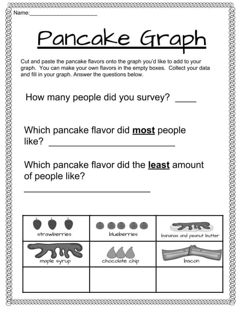
Then get them to problem solve/brainstorm. Eventually guide them to the fact that they need a few things. 1) A way to record the data. Maybe a class list with three columns, one column for each pancake type. 2) A clipboard to place the sheet on to make it portable and professional. 4) The need to decide what data are you collecting? Which 3 pancake flavors do you want to find out more about? Write those in the column. 3) A pencil with an eraser to record the data. No pens because we never do math with a pen because mistakes always happen. 3) A way to ask a person to take part in a survey. “Hello, I am conducting some research. Which type of pancake do you like the best strawberry, chocolate chip or maple syrup?” 4) How many people should the survey. Have them do 7. The graph goes to 7 and if everyone picks the same flavor you’ll be covered.
Here’s where you do the activity a 2nd time modeled correctly.
Step 4: You actually do the entire process while they watch. They are going to love it because you are going to ham it up and be your amazing silly self.
Now don’t worry too much about building the graph right now. We are still on the data collection part.
Pancake Data Collection (Smart Scientist Approach)
Here’s where you do the activity a 2nd time modeled correctly. This time be a “Smart Scientist”.
Step 4 You actually do the entire process while they watch. They are going to love it because you are going to ham it up and be your amazing silly self but in your smart scientist persona.
Now don’t worry too much about building the graph right now. We are still on the data collection part.
3rd Times a Charm
Now for the 3rd time. They do it themselves.
Here’s a pro tip: Divide the class into two groups. The surveyors and the surveyed. Have them do the activity. Then have them switch roles.
I find that if you just let them be the surveyor and the surveyed at the same time it gets really, really crazy. And while I like fun and engaged I don’t like CRAAAAAZZZZY.
Okay. Now everyone has their data sheet done. Ahhhhh!!!! Happy Dance.
Construct A Graph
Now it’s time to construct the graph.
Do this the same way you did the data collection Do it 3 times. The first time you do it dramatically and in your confused professor sort of way. Make your graph messy, inaccurate, etc. Then problem solve/brainstorm how a person could take data and present it in a graph that is accurate and easy to read. Talk about how good graphs help us to read information quickly by taking a lot of confusing data and putting it in a picture that is easy to understand.
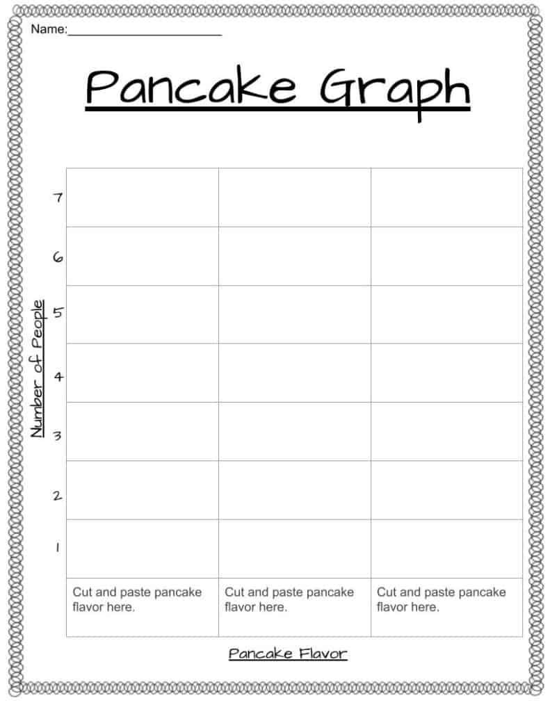
Now model the process correctly. Show them how to set up a graph. Talk about how good graphs have 3 titles. First title is what the graph is about and the other 2 titles show what data was collected and how it was counted.
Then show them how to take each line from their data a systematically record it onto their sheet. Each column of the graph should get a different color to make it extra fancy. Wa la. Done
Now it’s their turn. Let them at it. Have extra sheets in case they mess up.
Now let’s analyze the graph. Answer the questions on the paper. Talk about most/least. Ask more questions.
Whewww! You Did It!!
Now that wasn’t too bad and I guarantee the next time you do this process they will be experts. You may not even have to model it for them. (But then again you may…. They are little tiny people who can’t remember their birthday let alone how to go through the data/grafting/analyzing process.)
Click here to get your Data Collection and Graphing Freebie. Remember to read the book first.
Whaaaat you don’t have the book? Do you want it for Freeeee? Well just go on over to the side and put in your name and email and I will send it right out to you.
Now what’s the next freebie? It’s another writing one. Yahoo.
Until then make sure you catch me over on pinterest and TpT.
And if you are liking what you see, share it, and if you haven’t already, sign up go get these and many more freebies, tips and updates sent right to your mailbox.
Now, go be your amazing self.
Share Like A Boss


